This year's National League Cy Young race was pretty much a toss-up, with each of Jake Arrieta, Zack Greinke, and Clayton Kershaw putting up numbers we haven't seen in a decade or more.
By now we know that Arrieta wins the award, but being the Cubs homer I am, I started digging into the data a few weeks ago in attempt to show that Arrieta should win the award. However, as is often the case when walking into an analysis with preconcieved notions of its findings, I was left unable to make my case with a straight face.
Unable to confidently make the case that any of the contenders were more deserving of the award than their peers, I decided to turn my work into an article highlighting the historic years each of them had. Unfortunately, the article never wound up published, but you can still read it here, though it's obviously outdated now.
Since I tend to use this site more for technical posts, it seemed like a good idea to walk through a couple pieces of my work -- if you're interested in everything, I've pushed it up to GitHub.
Preprocessing
In order to show the stats I cared about and their progression throughout each pitcher's season, I needed to do some preprocessing of the data. Specifically, I needed to calculate a variety of statistics that are not included in the game logs from Baseball Reference.
After loading the dataset and transforming the innings pitched (IP) field to a numeric value, you'll see a fairly large section of code in the notebook that looks like this:
# Partial innings are stored as 7.1 or 7.2 in the Baseball Reference data.
# Convert it to properly represent 1/3 or 2/3 of an inning
# (necessary for various rate calculations).
def to_innings(IP):
    full, partial = map(float, str(IP).split('.'))
    return full + (partial / 3.)

# example: 7.1 --> 7.3333
arrieta['IP'] = arrieta.IP.apply(to_innings)

arrieta['rollingIP'] = arrieta.IP.cumsum()
arrieta['IPGame'] = arrieta.rollingIP / arrieta.Rk
arrieta['rollingER'] = arrieta.ER.cumsum()
arrieta['rollingERA'] = arrieta['rollingER'] / (arrieta['rollingIP'] / 9.)
arrieta['strikeoutsPerIP'] = arrieta.SO.cumsum() / arrieta['rollingIP']
arrieta['K/9'] = arrieta.SO.cumsum() / (arrieta['rollingIP'] / 9.)
arrieta['strikeoutsPerBF'] = arrieta.SO.cumsum() / arrieta.BF.cumsum()
arrieta['hitsPerIP'] = arrieta.H.cumsum() / arrieta['rollingIP']
arrieta['hitsPerAB'] = arrieta.H.cumsum() / arrieta.AB.cumsum()
arrieta['rollingWHIP'] = (arrieta.H.cumsum() + arrieta.BB.cumsum()) / arrieta['rollingIP']
# opponents against
arrieta['1B'] = arrieta.H - (arrieta['2B'] + arrieta['3B'] + arrieta['HR'])
arrieta['AVG'] = arrieta.H.cumsum() / arrieta.AB.cumsum()
arrieta['OBP'] = (arrieta.H.cumsum() + arrieta.BB.cumsum() + arrieta.HBP.cumsum()) \
                    / (arrieta.AB.cumsum() + arrieta.BB.cumsum() +
                        arrieta.HBP.cumsum() + arrieta.SF.cumsum())
arrieta['SLG'] = (arrieta['1B'].cumsum() + (arrieta['2B'].cumsum() * 2) +
                 (arrieta['3B'].cumsum() * 3) + (arrieta['HR'].cumsum() * 4)) \
                            / arrieta.AB.cumsum()
arrieta['OPS'] = arrieta.OBP + arrieta.SLG

# rates
arrieta['BABIP'] = (arrieta.H.cumsum() - arrieta.HR.cumsum()) \
                        / (arrieta.AB.cumsum() - arrieta.SO.cumsum() -
                            arrieta.HR.cumsum() + arrieta.SF.cumsum())
arrieta['HR%'] = arrieta.HR.cumsum() / arrieta.BF.cumsum()
arrieta['XBH%'] = (arrieta['2B'].cumsum() + arrieta['3B'].cumsum() +
                    arrieta['HR'].cumsum()) / arrieta.BF.cumsum()
arrieta['K%'] = arrieta['SO'].cumsum() / arrieta.BF.cumsum()
arrieta['IP%'] = (arrieta.AB.cumsum() - arrieta.SO.cumsum() -
                    arrieta.HR.cumsum() + arrieta.SF.cumsum()) \
                        / arrieta.BF.cumsum()
arrieta['GB%'] = arrieta['GB'].cumsum() /
                    (arrieta.AB.cumsum() - arrieta.SO.cumsum() -
                        arrieta.HR.cumsum() + arrieta.SF.cumsum())
Here we're adding new, cumulative statistics to each pitcher's DataFrame (e.g. we can easily say what Arrieta's ERA was after his fourth start, or what his batting average on balls in-play (BABIP) was in the second half of the season).
Visualizing their seasons
Now that we have various statistics on a rolling basis, we need a way to compare their performances throughout the season. Thankfully, this is a perfect use case for small multiples, which is a technique meant specifically for comparison.
To do so, we can create a dictionary where each pitcher is a key, and the value
is another dictionary containing that pitcher's DataFrame, as well as a color
and line style which we'll use in our plot. Then, we'll create a grid of empty
subplots, which will be populated by looping through our PITCHERS dictionary.
from collections import OrderedDict

PITCHERS = {'Arrieta': {'df': arrieta, 'color': ja, 'style': '-'},
            'Greinke': {'df': greinke, 'color': zg, 'style': '-'},
            'Kershaw': {'df': kershaw, 'color': kc, 'style': '--'}}
PITCHERS = OrderedDict(sorted(PITCHERS.items()))
stats = ['IP%', 'BABIP', 'XBH%', 'HR%', 'K%']

row_titles = ['{}'.format(row_title) for row_title in PITCHERS.keys()]
col_titles = ['{}'.format(col_title) for col_title in stats]

fig, axes = plt.subplots(figsize=(15,6), nrows=len(PITCHERS),
                            ncols=len(stats), sharex=True)
fig.tight_layout(pad=1.2, h_pad=1.5) # adjust layout spacing

# label each column with stat name
for ax, col_title in zip(axes[0], col_titles):
    ax.set_title(col_title, size=15)

# label each row with player name
for ax, row_title in zip(axes[:,0], row_titles):
    ax.set_ylabel(row_title, rotation=0, size=15, labelpad=40)

# create grid - one chart for each pitcher + stat combination
for i, (name, pitcher) in enumerate(PITCHERS.items()):
    for j, stat in enumerate(stats):
        title = '{}: {}'.format(name, stat)
        pitcher['df'][stat].plot(ax=axes[i,j], color=pitcher['color'],
                                    linestyle=pitcher['style'])

        # for ease of comparison, let's plot the other pitchers on the same chart
        # but let's make them a light grey with the appropriate linestyle
        for k, v in PITCHERS.items():
            if k != name:
                v['df'][stat].plot(ax=axes[i,j], color='grey', alpha=0.4,
                                    linestyle=v['style'])

        axes[i,j].tick_params(axis='both', which='major', labelsize=13)
        axes[i,j].axvline(allstarbreak, color='k', linestyle=':', linewidth=1)
        axes[i,j].yaxis.set_major_locator(MaxNLocator(nbins=4))
        axes[i,0].set_ylim(0, 1.) # IP%
        axes[i,1].set_ylim(0, .500) # BABIP
        axes[i,2].set_ylim(0, .16) # XBH%
        axes[i,3].set_ylim(0, .04) # HR%
        axes[i,4].set_ylim(0, .36) # K%
plt.savefig('images/rates-comparison.png', bbox_inches='tight', dpi=120)
The resulting output is a 3 x 5 grid of charts, where each row corresponds to a pitcher, and each column is a statistic.
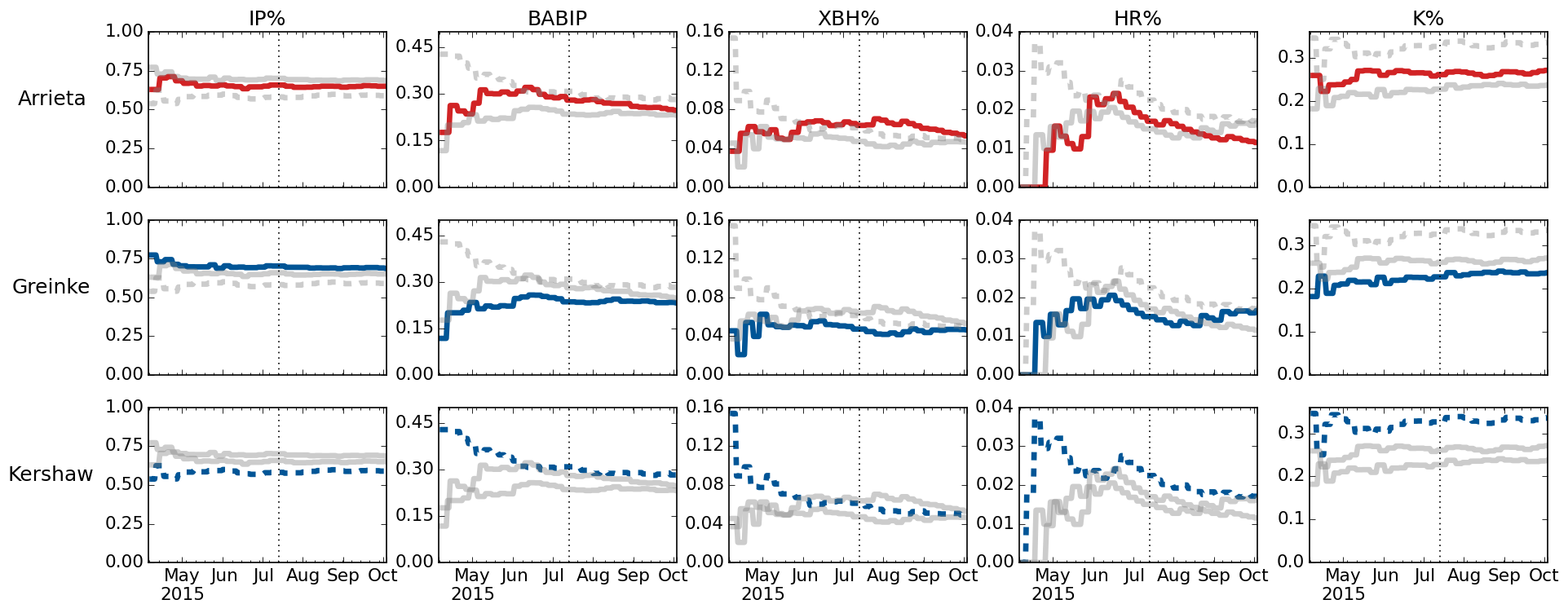
Again, this technique is meant for comparing different dimensions (people, cities, departments, etc.) against one another.
For instance, looking down the left-most column, we can see that batters put the ball in play (IP%) about equally against Arrieta and Greinke, but less so against Kershaw. Looking down the far right column, we can see that Kershaw was put in play less often due to his stronger ability to strike hitters out (K%).
Comparing batted ball exit velocity
With PITCHf/x installed in every MLB park, we can also look at data around each pitch made throughout the season. Baseball Savant is a great source of this data.
Since it still wasn't clear who should win the award after looking at a variety of stats, it seemed interesting to answer the most basic question: Which pitcher was hit harder? We know there's a significant relationship between a batted ball's exit velocity and its likelihood to wind up a hit, so this should give us some indication of who was the more difficult pitcher to face.
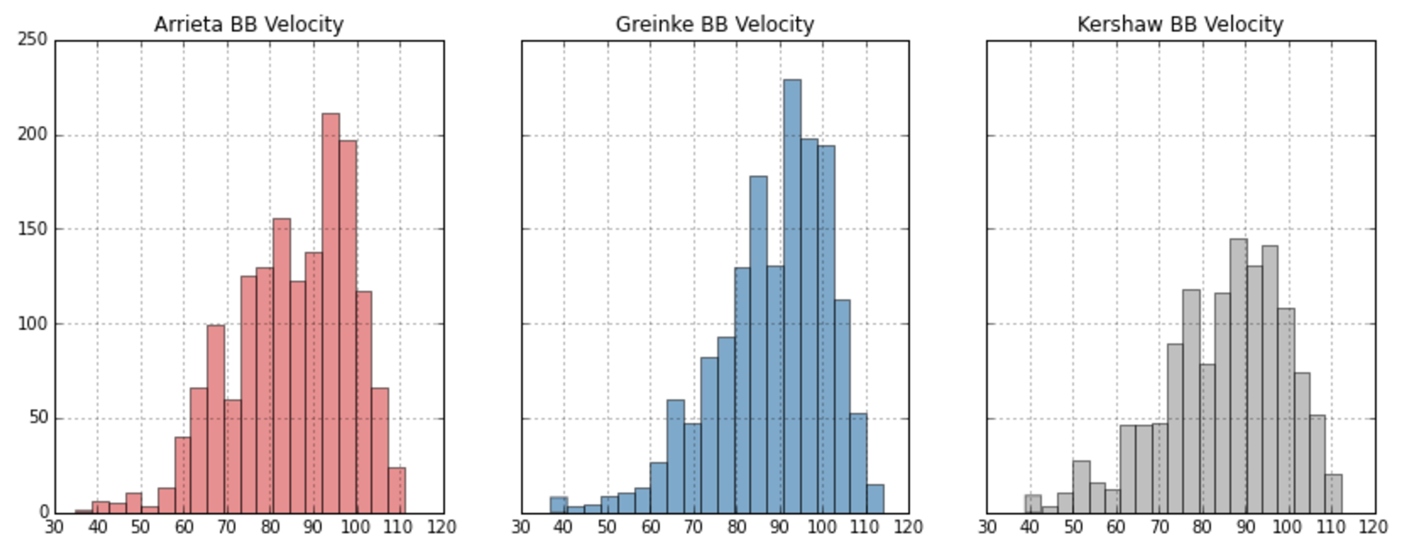
Looking at the observed distributions of their batted ball exit velocity doesn't tell us much -- Arrieta's mean exit velocity was 85.0 MPH, Greinke's 88.4, and Kershaw's 84.9. Those numbers are pretty close -- so close that we shouldn't assume they're statistically significant, so let's test that using the bootstrap.
With bootstrapping, we generate N random samples of our dataset (typically 1,000 or 10,000). Since we're interested in speaking about the "average" batted ball exit velocity, we take the mean of each random sample, resulting in an approximation of the mean's true distribution. From there, we can look at the 95% confidence intervals to test for significance.
np.random.seed(49) # set random seed for consistency

# only sample from pitches that were hit
arrietaBBs = arrietaPitches[arrietaPitches.batted_ball_velocity > 0].batted_ball_velocity
greinkeBBs = greinkePitches[greinkePitches.batted_ball_velocity > 0].batted_ball_velocity
kershawBBs = kershawPitches[kershawPitches.batted_ball_velocity > 0].batted_ball_velocity
arrietaSamples = []
greinkeSamples = []
kershawSamples = []

# generate 1000 randomly sampled datasets for each pitcher
# each sampled dataset is the same length as our observed dataset
for i in range(1000):
    arrietaSamples.append(np.random.choice(arrietaBBs, size=len(arrietaBBs), replace=True))
    greinkeSamples.append(np.random.choice(greinkeBBs, size=len(greinkeBBs), replace=True))
    kershawSamples.append(np.random.choice(kershawBBs, size=len(kershawBBs), replace=True))

# get the mean of each randomly sampled dataset
arrietaMeans = [np.mean(obs) for obs in arrietaSamples]
greinkeMeans = [np.mean(obs) for obs in greinkeSamples]
kershawMeans = [np.mean(obs) for obs in kershawSamples]

# plot the distributions
fig, ax = plt.subplots(figsize=(10, 4))
plt.hist(arrietaMeans, alpha=.5, label='Arrieta', color=ja)
plt.hist(greinkeMeans, alpha=.6, label='Greinke', color=zg)
plt.hist(kershawMeans, alpha=.3, label='Kershaw', color=kc)
plt.legend(loc='best')
plt.xlabel('Avg. Batted Ball Velocity', fontsize=15)
ax.spines['right'].set_visible(False)
ax.spines['left'].set_visible(False)
ax.spines['top'].set_visible(False)
ax.xaxis.set_ticks_position('bottom')
plt.tick_params(axis='both', which='major', labelsize=13)
ax.get_yaxis().set_ticks([])
plt.savefig('images/avg-batted-ball-velocity.png', bbox_inches='tight', dpi=120);
![Batted Ball Exit Velocity] (https://raw.githubusercontent.com/gjreda/cy-young-NL-2015/master/images/avg-batted-ball-velocity.png)
While the above chart doesn't explicitly show their 95% confidence intervals, it's pretty clear that Greinke's mean exit velocity is significant when compared to Arrieta and Kershaw -- allowing us to say that, on average, Greinke was hit harder throughout the season than both Arrieta and Kershaw. We cannot confidently say there was a difference in exit velocity when comparing Arrieta and Kershaw to each other though.
The chart above is especially interesting in the context of our small multiples charts. In particular, that Greinke had the lowest ERA, batting average on balls in play (BABIP), and extra base hit rate (XBH%) of the three, despite allowing harder contact. This suggests that Greinke received a bit more help from his defense than Arrieta and Kershaw.
If you're interested in more analysis on the season each of these three had, Dave Cameron at FanGraphs has an excellent write-up explaining the rationale behind his vote.
Hope you've enjoyed the post, and let me know if you have any questions.